12 January 2024
As we review and reflect on the year 2023, our most notable achievement is the re-definition of what Vioside means to us as a team. We decided that we had to take a deep look inside Vioside’s core values and reimagine our brand. With this brand, we wanted to capture what we do, but most importantly, why.
When we started Vioside 13 years ago, while building our very first brand, we stopped to think why we do what we do. It is easy to say that Vioside is a software development company specialising in mobile apps and services, but why are we so passionate about it? What makes us follow this line of work? And the answer has always been clear. At Vioside, we are passionate about simplifying lives through software. That could be either through very simple automation tools like calculating common free lessons with friends at school, to providing neat and accessible information through a simplified design.
In fact, what triggered Vioside to get going is the boom of smartphones. Mobile apps and the App Store opened up a huge gateway for developers to provide tools to users that can so easily be carried around everywhere, and with access to sensors such as GPS, camera, motion sensors, the possibilities were exciting. This gave us the spark to start building tools and simplify our users’ lives.
The idea of simplification lead us to the name Vioside, inspired by the violet flower that symbolises simplicity. For many years, our flower in the brand meant the simple side of software, with the slogan “Crafting Simplicity into Mobile Apps”. This year we decided to simplify our brand as well. We wanted a brand that is minimal, professional and captures our essence. We had to rethink our logo, colour scheme and even redevelop our website from the ground up. Now, we “Craft Simplicity”.
Our new logo captures it all. From retro-feel pixelated on the left to modern and clear on the right, pixelated to pixel-perfect, complex to simple, idea to reality. This is while also showing our passion for tech underneath a simplified human interface. Our colour scheme, typography and overall design had to also represent minimalism and clarity while subtly understating our passion for tech.
A special thanks goes to our friends and partners in branding and design, Hangar. Having worked together closely, they were quick to understand the character we are trying to portray and reflected this perfectly with our new branding. Their case study for Vioside can in fact be found on their website here.
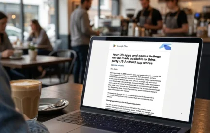
Latest Blog Posts //